In effort to support data exploration and codebook making, the library also contains functions to generate single variable descriptive graphs based on a variable’s class.
For example, take the County_Equivalent_Name variable
from the hpsa_primarycare data set, which is a character.
By passing this data set and variable to the
visualize_sngl_var() we get a graph with bars presenting
the count of each variable. More specifically, the function takes
unsummarized data and returns summarized scores where each observation
contributes to one unit of height for each bar. Lastly, in the example
below, we set the flip argument to TRUE in
order to pivot the graph on its x-axis.
rcahelpr::visualize_sngl_var(df = rcahelpr::hpsa_primarycare,
                             var = "County_Equivalent_Name",
                             xlab = "County",
                             flip = TRUE)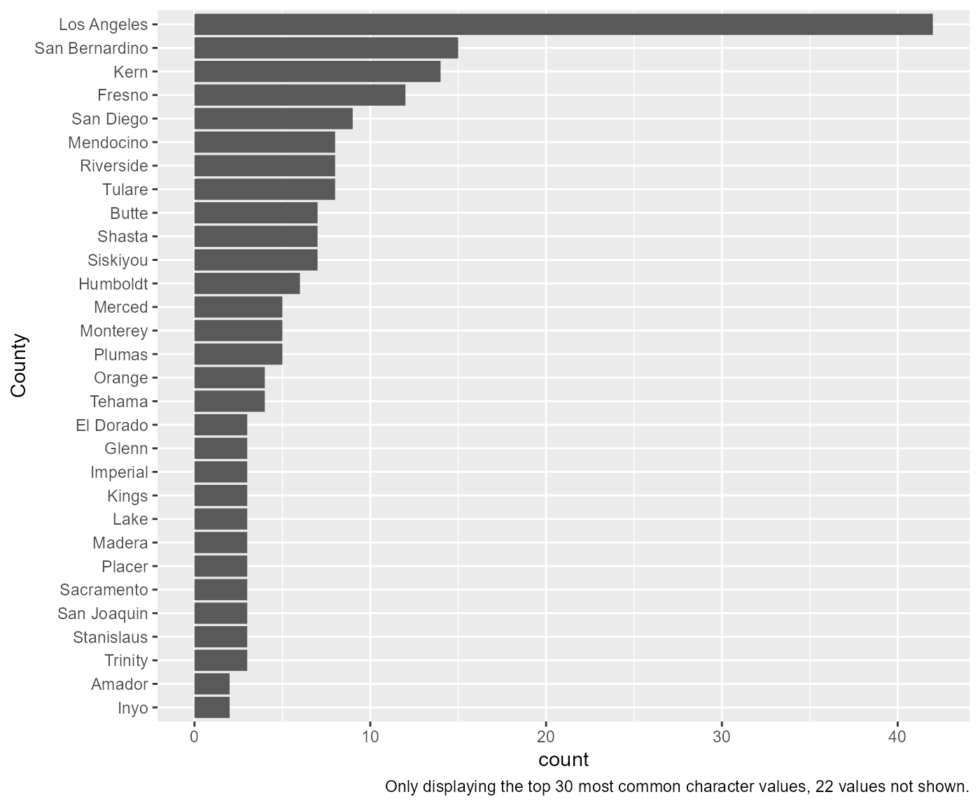
In the prior example, the df, var, and
xlab arguments are requirements, the rest are optional.
Among other optional features is the ability to change the y-axis labels
and setting a cuttoff for larger data somewhat easily:
rcahelpr::visualize_sngl_var(df = rcahelpr::hpsa_primarycare,
                             var = "County_Equivalent_Name",
                             xlab = "County",
                             flip = TRUE,
                             ylab = "Count of apperances",
                             cutoff = 20)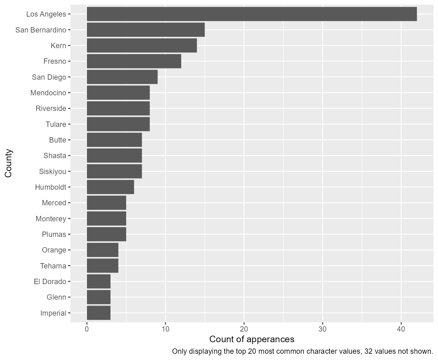
Another optional feature is the ability to pass the function custom ggplot themes:
my_theme <- ggplot2::theme_minimal()

rcahelpr::visualize_sngl_var(df = rcahelpr::hpsa_primarycare,
                             var = "County_Equivalent_Name",
                             xlab = "County",
                             flip = TRUE,
                             ylab = "Count of apperances",
                             cutoff = 20,
                             theme = my_theme)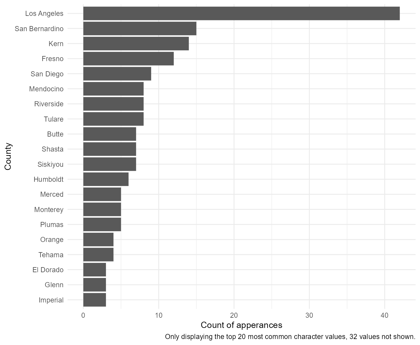
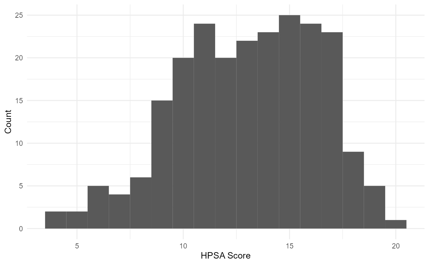
Note that the function automatically adapts to working with numeric variables:
rcahelpr::visualize_sngl_var(df = rcahelpr::hpsa_primarycare,
                             var = "HPSA_Score",
                             xlab = "HPSA SCORE")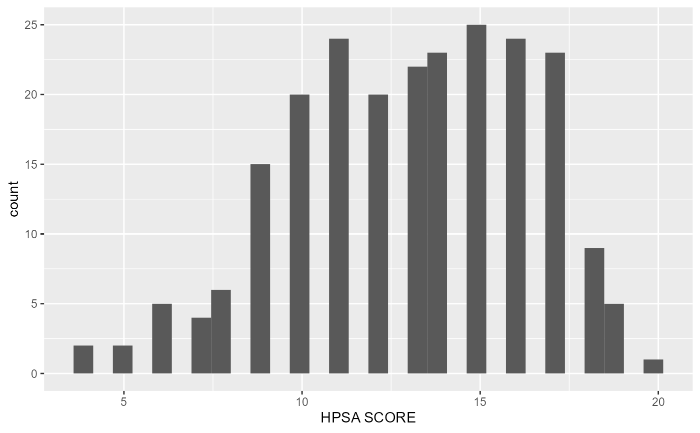
Under the hood, the function acknowledges that the declared variable
is continues and proceeds to generate a histogram, which bins the data,
then counts the number of observations in each bin. You can control the
width of the bins with the binwidth argument. It is very
important to experiment with the bin width. The default just splits your
data into 30 bins, which is unlikely to be the best choice. You should
always try many bin widths, and you may find you need multiple bin
widths to tell the full story of your data. For example:
rcahelpr::visualize_sngl_var(df = rcahelpr::hpsa_primarycare,
                             var = "HPSA_Score",
                             xlab = "HPSA SCORE",
                             binwidth = 10)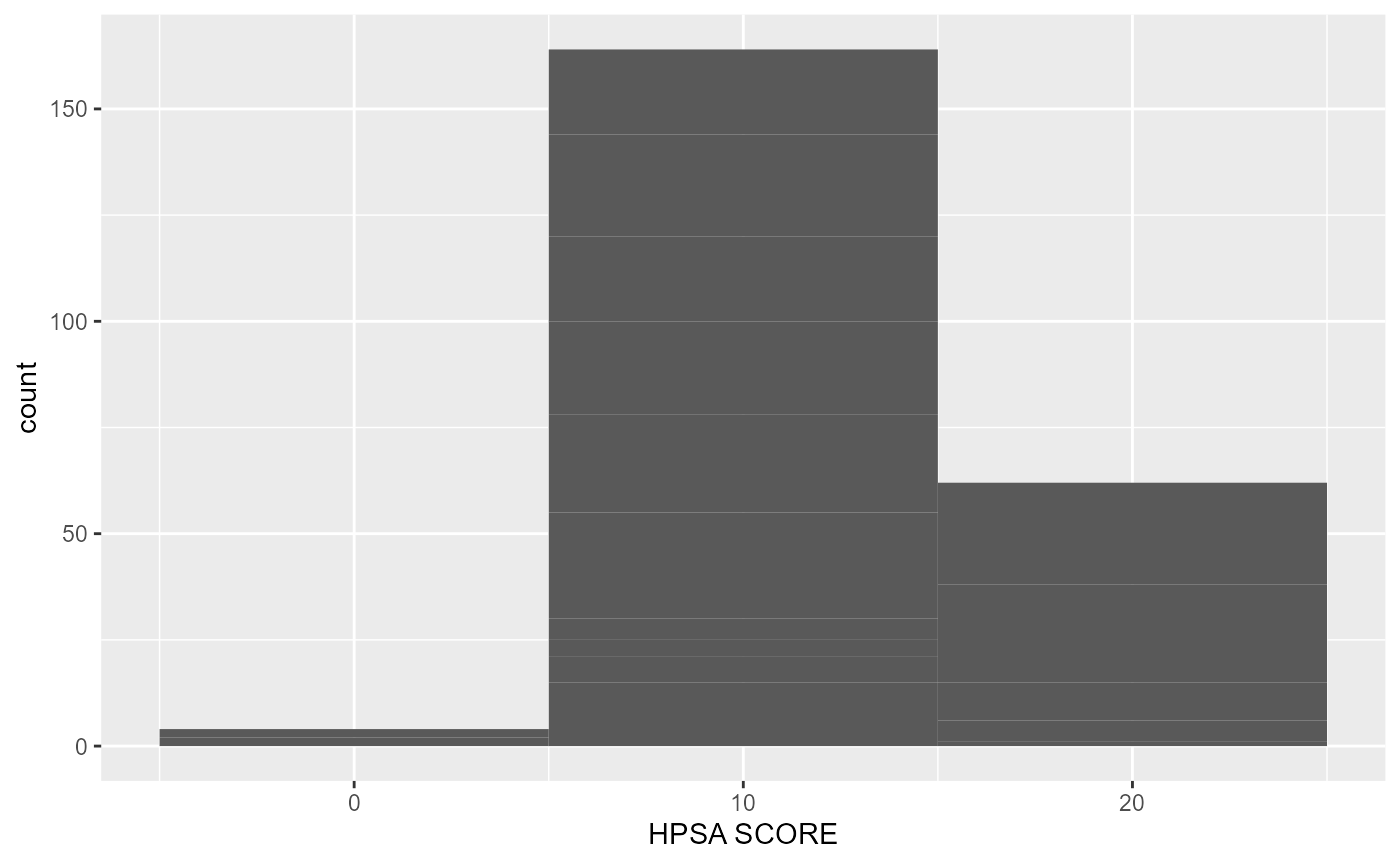
Or:
rcahelpr::visualize_sngl_var(df = rcahelpr::hpsa_primarycare,
                             var = "HPSA_Score",
                             xlab = "HPSA SCORE",
                             binwidth = 1)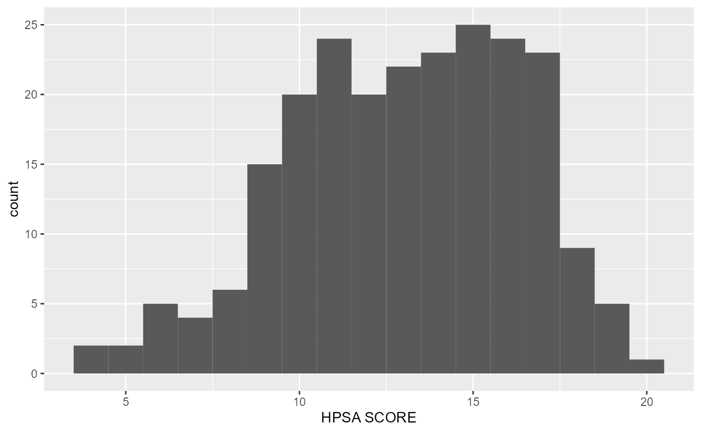
Out of the two experiments above, it appears that a
binwidth of 1 fits the data a little nicer. Let’s polish
this graph up a little like we did above:
rcahelpr::visualize_sngl_var(df = rcahelpr::hpsa_primarycare,
                             var = "HPSA_Score",
                             xlab = "HPSA Score",
                             ylab = "Count",
                             binwidth = 1,
                             theme = my_theme)